


Application monitoring overview
The following screen shot shows the monitoring page for an example call-record-pipeline application. Blue arrows call out the main components. From the top left working clockwise, these include:
-
Controls - icons to navigate to the GRAFANA dashboard or the infrastructure WORKLOADS view.
-
The blueprint graph pane, available in different themes
-
The VIEW selector, which allows you to select the time period
-
Application Details, which roll up health status and events
-
A Selection: - pane that identifies the current selection and lets you choose between viewing Health and streamlet Shape
-
Metrics - graphs of Consumer lag and Throughput records along with other key metrics
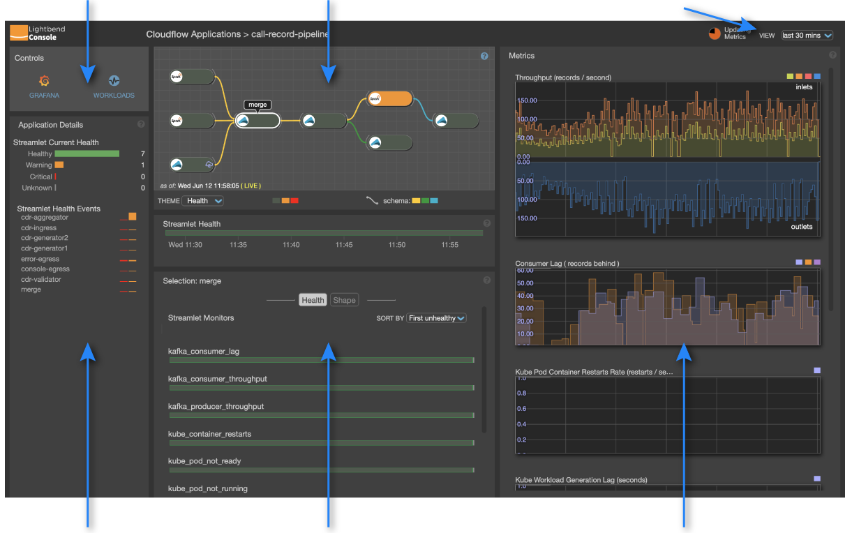
This page describes how to understand and change the time period and describes selection, crosshair behavior, and key performance metrics. The next page describes the important Blueprint graph pane in more detail. See the Application Monitoring page for details about other page elements.
Current time and time period
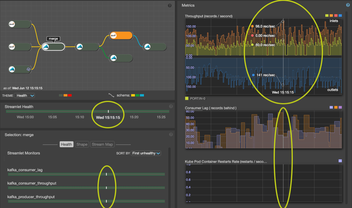
When you first view the application monitoring page, the current time sample shown is NOW. Notice the timestamp and ( LIVE ) label in the bottom of the blueprint graph pane. The current time is also reflected in the timeline time callout. As you hover over a graph, health bar or timeline, the current time changes, based on the position of your mouse in the panels. A vertical crosshair in each time-based panel (graphs, health bars) tracks the time as you hover. When the mouse moves outside of the time-sensitive panels, the current time snaps back to the most recent time sample.
| Due to metric sampling, as described next, (LIVE) could be within seconds or minutes in the past. Latency is a function of the observation time period. |
Metrics are collected from streamlets at one rate (currently 10 second intervals) but health bars and graphs are calculated by sampling these underlying metrics. The sampling rate governs the temporal resolution of health bars and graph displays. Ten second sampling is used for one hour duration (360 samples / hour), 40 seconds for a four hour duration, etc. The health of a time-sample reflects the "worst" health over all collected metrics within its interval. However metrics shown in graphs are instantaneous samples and reflect the state of the system at the time of the last collection within the interval.
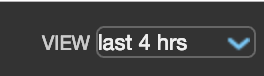
The time period determines the sampling rate for all collected metrics. You can select a duration from the VIEW drop-down menu in the upper right corner of the page. The available time period options include: 30 minutes, 1 hour, 4 hours, 1 day and 1 week. Metrics are streamed based on the selected time period.
| Select a short time period for low latency. |
The Updating Metrics icon in the top navigation bar shows the current status of the update cycle.
Changing the selection
All panels on the application monitoring page are tightly coupled. Making a selection in one frequently affects others. You can select information at two levels: (1) for the application or (2) for a streamlet. By default, the application is selected. When the page first loads, the center panel presents full of rows of health bars, one for each streamlet in the application. If you click a streamlet in the blueprint diagram, or click a healthbar title, focus shifts in all panels to that streamlet, which becomes the current selection.
| Select the application by clicking the blueprint graph background, or select a streamlet by clicking it. |
Crosshair behavior
As you move the mouse over a graph you’ll see the crosshair track the mouse. A timeline callout appears below the graph. In addition you’ll see a small vertical line drawn on all graphs, health bars and timelines on the page - allowing you to correlate behavior across metrics, monitors and streamlets. When hovering over a metric graph, the vertical crosshair shows the (up to six) metric values (one per curve) at the current time. Callout values are shown if the mouse is within one time sample from the mouse location - meaning that unknown (missing) data is not shown.
Key performance metrics
Lightbend Console provides the following for Cloudflow applications:
-
Consumer Lag is a key metric available for streamlet inlets.
Each inlet is part of a Kafka Consumer Group across all the instances of that streamlet. If there is one instance of the streamlet, it is a group of one. The group members divide up the Kafka partitions of the topic they are reading. Every partition has a lag or latency measurement, which is how far back the consumer group reader is from the most recent message. This metric is captured in terms of the number of records each reader (instance) is behind the most recent record produced upstream—and is presented as the maximum across all readers in the group.
-
Throughput, another key metric, is available on both inlets and outlets.
On streamlet inlets it represents the rate of data records read by the streamlet (in records / second). On outlets it is the rate of data records produced by the streamlet. It is useful to note that there might not be a one-to-one relationship between inlet records and outlet records and is dependent on the functionality of the streamlet itself.
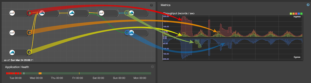
For application throughput we compare the application’s incoming data (i.e. the data produced on all outlets of all ingresses) with the outgoing data (i.e. the data consumed on all inlets of all egress streamlets in the application). Incoming data is shown in the upper stack, outgoing on the bottom stack as in the following image (note that the outgoing only has one curve (the blue one) as the other egress streamlet inlet rate is zero in this particular case).
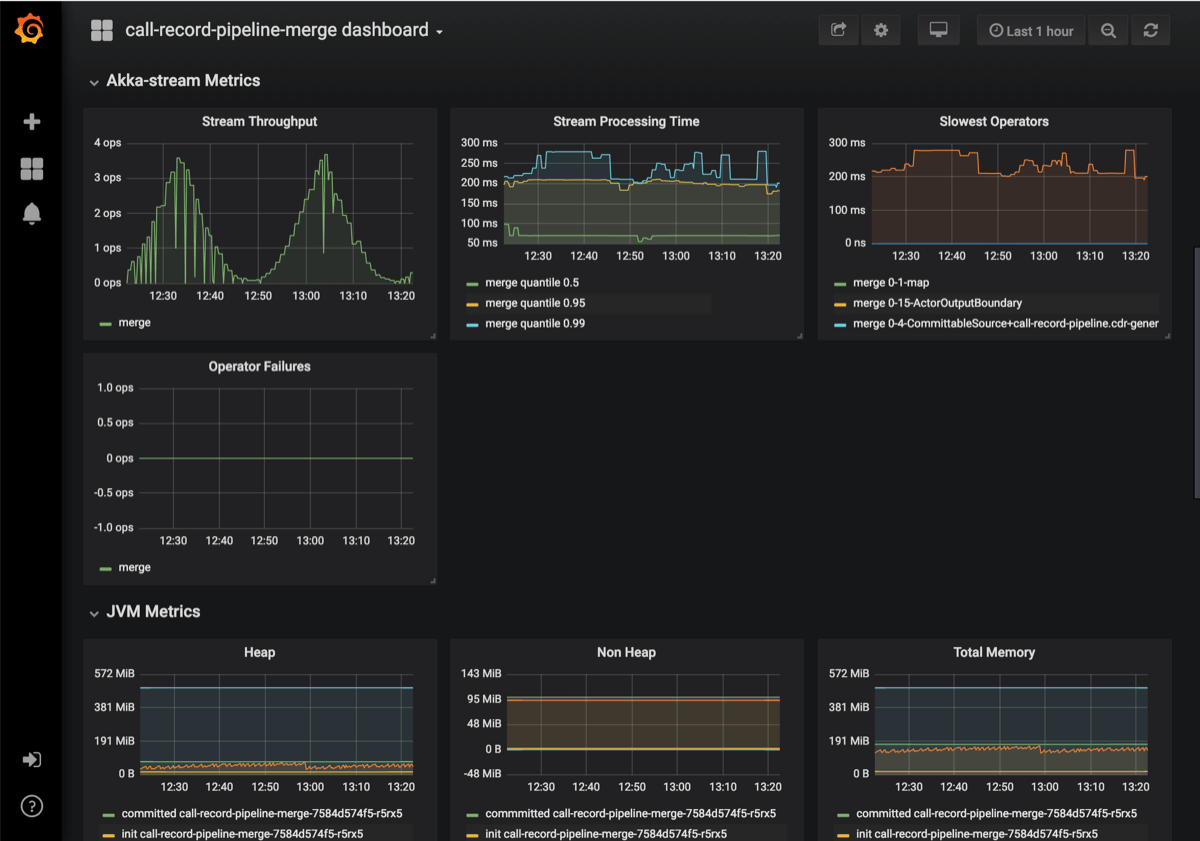
Grafana dashboards
There is a Grafana metric dashboard for each streamlet as well as the application as a whole. In these dashboards you can see a variety of metrics for each service type of the current selection (Kafka, Akka Streams, Spark, JVM and Kubernetes) separated into groups. Here you also have finer-grain control over time periods and other graphing attributes.
What’s next
Since it provides a wealth of information about application composition, let’s first take a closer look at the Blueprint graph.